This year’s launch of Erin Condren planners has been an interesting one, with the improvement to the paper and the release of the new hardbound planners which are fantastic. I got the large hardbound which comes in a vertical layout only and there is a smaller one that comes in a horizontal only (which I have on the way). But here is a look at the planner.
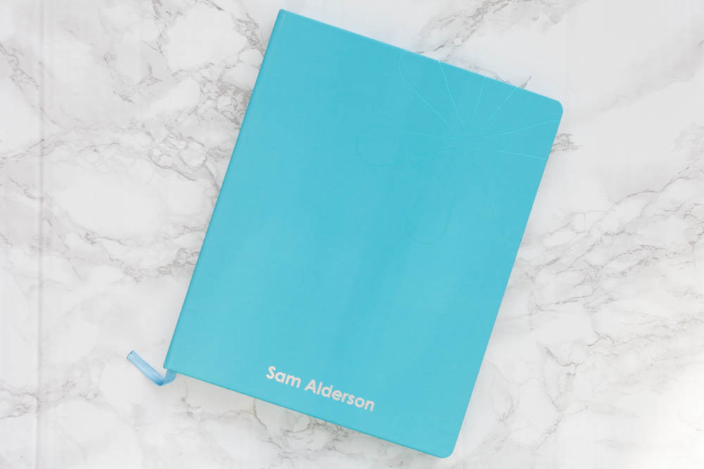
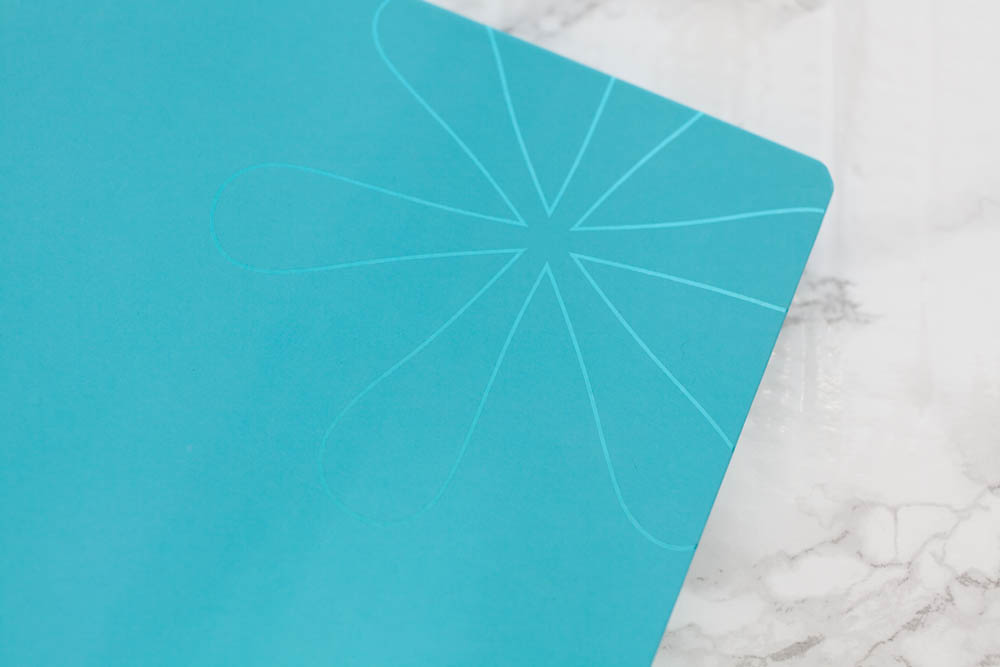
It’s such a pretty book and the colour is beautiful! There is a lovely detail on the front of the classic Erin Condren asterisk in a metallic version of the colour of the book.
On the spine of the books is a little flag that has 2017/2018.

You can also get this book personalise with one line of text so I decided to go with Sam Alderson, which will be my married name. It is so weird to see this on a planner now.
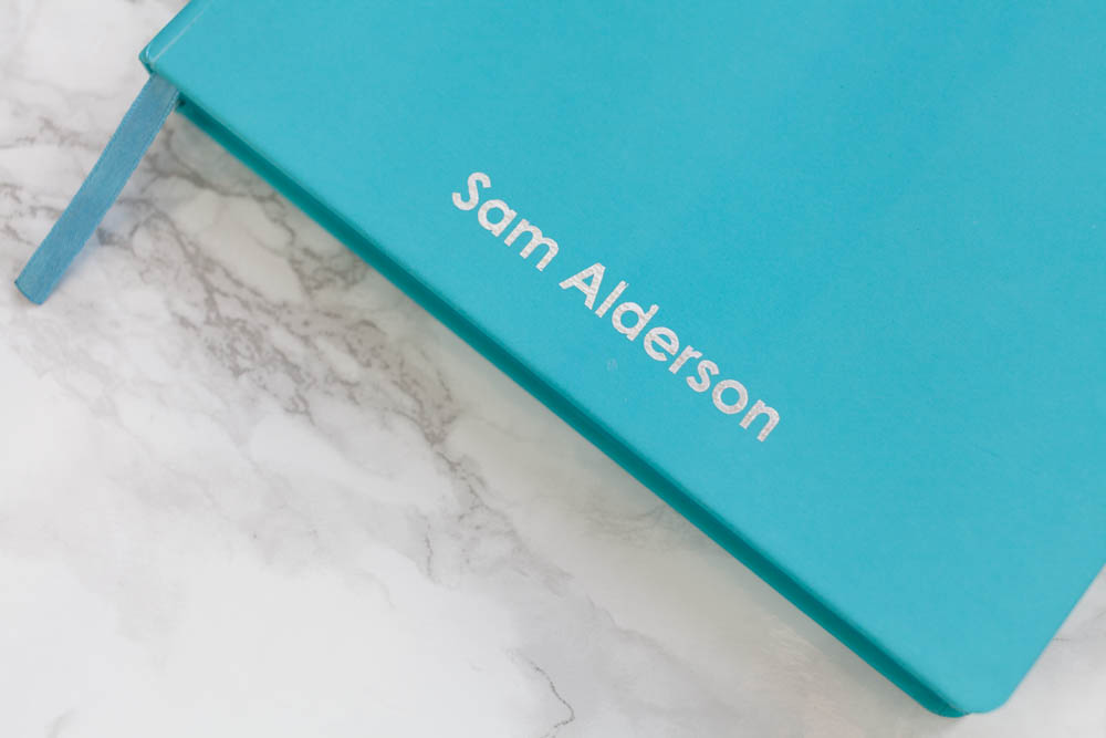
Strange! However, I was a bit disappointed with the quality of the foil, I have contacted support and they are sending me out a new one, I will keep you updated on that but here is a closer look at the foil.

I have a few more photos of the inside to share with you so let’s get stuck in!
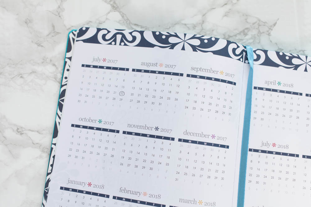
As you would expect in the front of the planner you get the rest of this year and the whole of next year overview. This is great for tracking holidays, days off, kid’s holidays or work days. The first thing I did was circle July 22nd, because of the wedding!

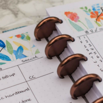
You then jump straight into the months. These are much bigger then the coiled planners, I must say I am really impressed with the quality of the paper and the print quality as well.
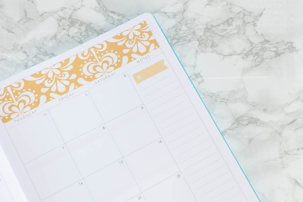
You also still have the sidebar that is very simple and I’ll be using this as my monthly to-do list. This will be things that need to be done that month. Next, we go into the weeks.
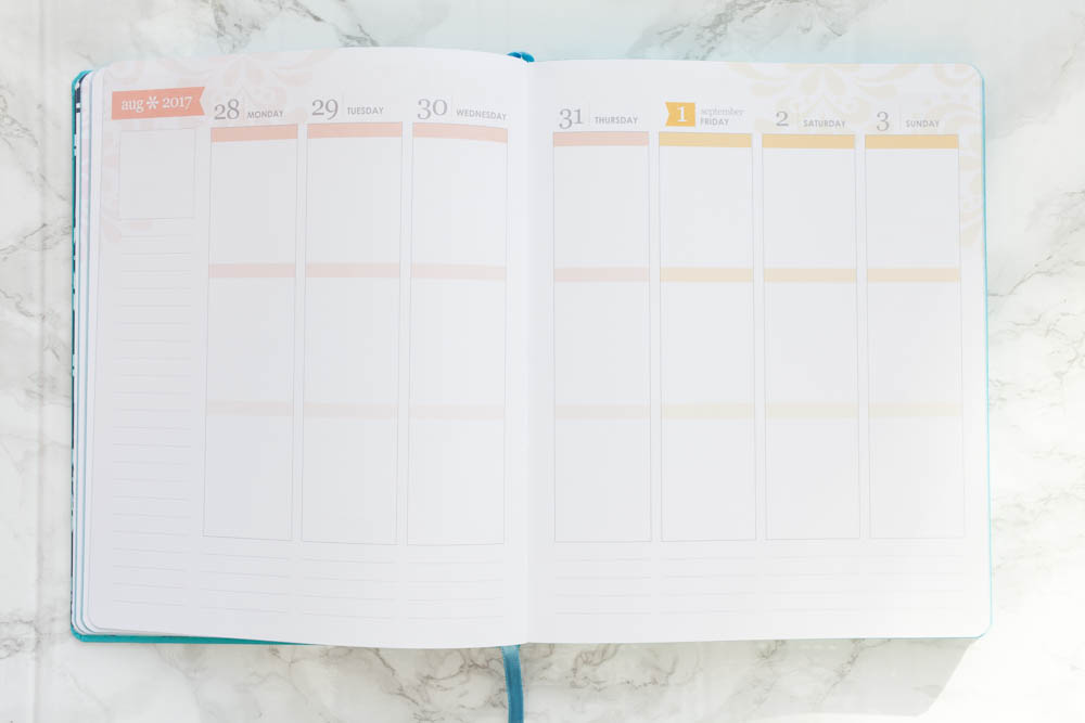
This is bigger then the coiled version of the planner – Ill insert a picture of the size difference this weekend with some stickers in the weekly so you can see the difference.

I can’t wait to get back into planning vertically again! I have gone through a ton of different styles of planning and I always come back to white space planning with icons and appointment boxes, it’s just the way my brain works and with this being a book, you can’t use loads of stickers otherwise this is going to bulk up to no end!

This binding is not going to allow for a lot of stickers and white space planning or pen planning is going to be the only options for this planner. If you were to do a no white space in this planner every week the binding of this book is not going to take the strain of bulk.
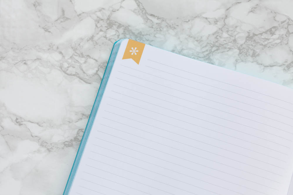
One noticeable difference is that there is not note pages before the month so there are more in the back of the book there are some lined.
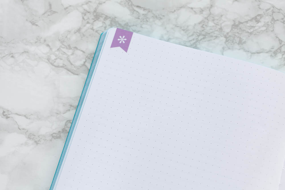
Dot grids.
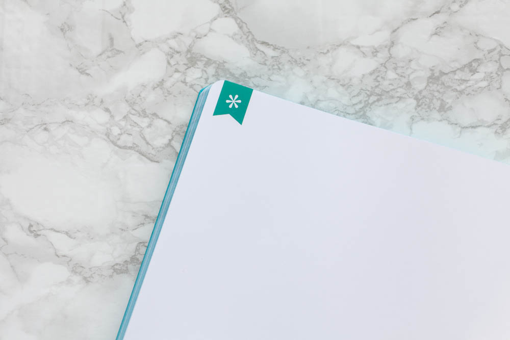
And plain. All have this flag detail in different repeating colours.
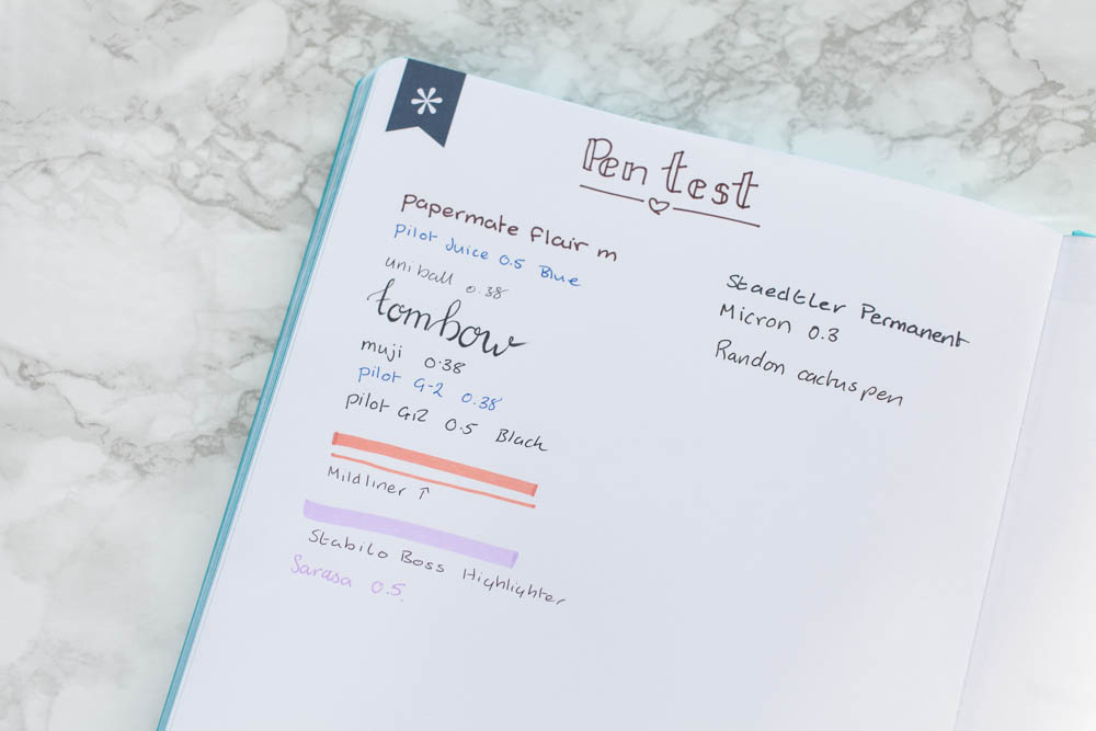
Like I said earlier, I’m really impressed with the quality of the paper in this year’s planners. So, I just had to do a pen test to see if it would stand up to a few of my go-to pens.

Not bad! Still a little shadowing but only a small amount of bleeding through the actual paper. The most noticeable are the highlighters but I kinda knew that would happen.

And finally, in the back, you have the 2019 year overview, with space for a few notes. Overall, I’m happy with the planner, obviously disappointed in the foil on the front but there are fixing that and the spine did break when I was breaking it in, but I put that down to me being to ruff with it. I can’t wait to start using this and showing you guys how I get on with it.
Did you get anything in this year’s launch? If this is your first year don’t forget to use this link to get $10 off you first purchase! That’s all from me today! If you like what you have seen here make sure you hit that follow button on the left to get notifications whenever I post bloggity stuff. And you can follow me on Instagram @samplanslife.
Laters!
Sam